
When designing a home office, people often focus on furniture and lighting—but color is just as important. The shades that surround you while working can directly impact your mood, energy levels, focus, and even creativity. In small apartments, where your workspace may share space with other living zones, choosing the right color palette becomes even more strategic.
In this article, we’ll explore how color influences productivity and how to use it wisely in your home office—whether it’s in a nook, a hallway, or the corner of your living room.
1. Why Color Matters in a Home Office
Color psychology studies show that colors affect our:
- Emotions
- Behavior
- Cognitive performance
In a workspace, color can help you:
- Focus longer
- Stay calm under pressure
- Spark creative thinking
- Reduce fatigue
Even subtle shifts in shade can make a big difference in how a room feels and functions.
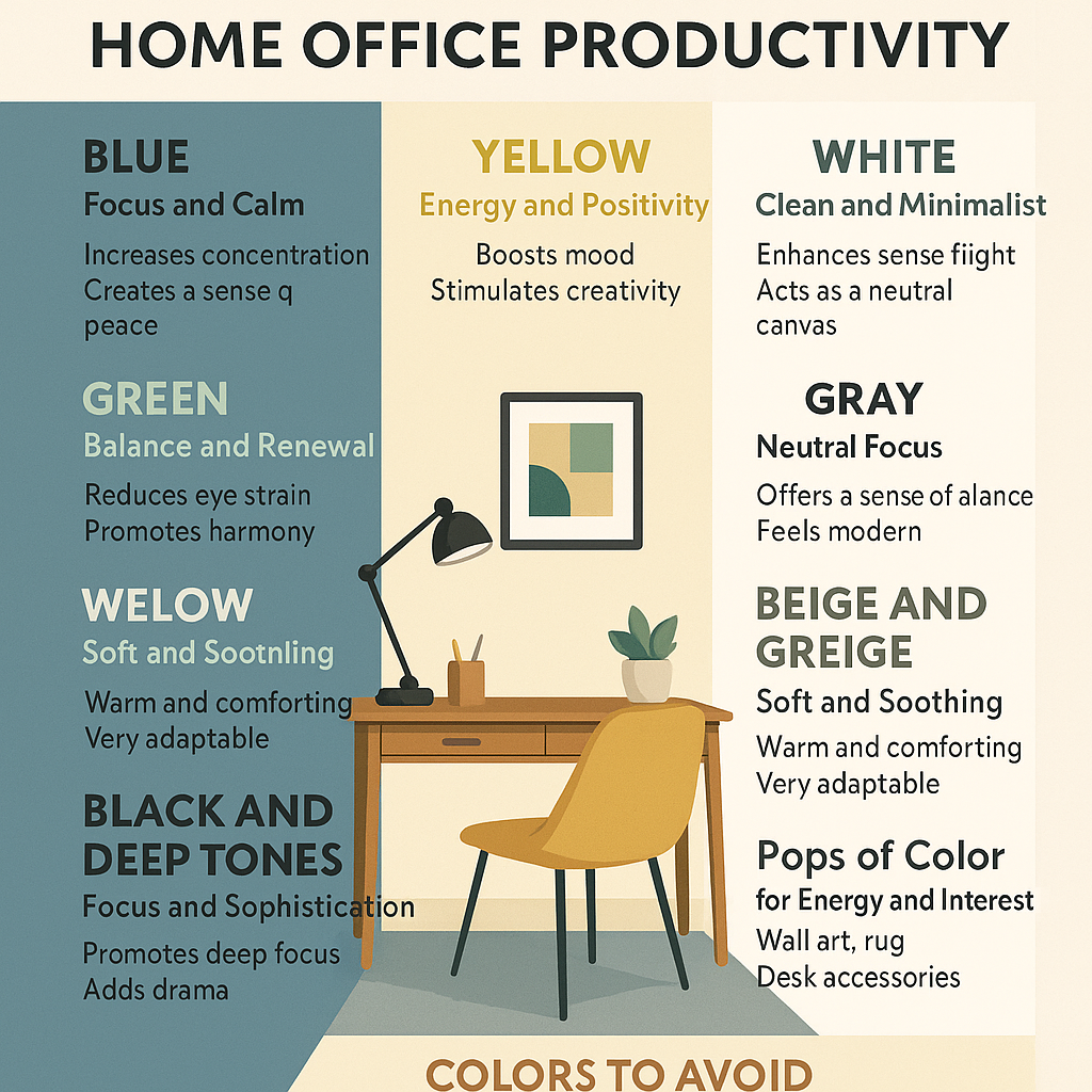
2. Blue: The Color of Focus and Calm
Benefits:
- Increases concentration
- Enhances mental clarity
- Creates a sense of peace
Best for:
- High-focus tasks (writing, data entry, research)
- Individuals who feel easily overwhelmed
How to use it: Try muted tones like slate blue, soft navy, or dusty teal. Use blue as an accent wall, or pair it with gray and white for a clean, serene workspace.
3. Green: Balance and Renewal
Benefits:
- Reduces eye strain
- Promotes calm and harmony
- Connects us with nature
Best for:
- Designers, creatives, or anyone who spends long hours at the screen
How to use it: Sage green or soft olive is ideal for walls or decor. Add plants to enhance the natural feel. Green pairs well with wood tones, white, or brass.
4. Yellow: Energy and Positivity
Benefits:
- Boosts mood
- Stimulates creativity
- Encourages optimism
Best for:
- Brainstorming zones
- Creative work like marketing, design, or writing
How to use it: Opt for pale yellows or mustard tones in accents—pillows, a lamp base, or desk accessories. Too much bright yellow can feel overwhelming in small spaces.
5. White: Clean and Minimalist
Benefits:
- Enhances natural light
- Creates a sense of openness
- Acts as a neutral canvas
Best for:
- Minimalist or Scandinavian-inspired workspaces
- Small rooms that need to feel bigger
How to use it: Combine with warm textures (wood, linen, jute) to avoid sterility. Add black or earthy accents for contrast and interest.
6. Gray: Neutral Focus
Benefits:
- Offers a sense of balance
- Doesn’t distract
- Feels modern and professional
Best for:
- Analytical or financial work
- Tech-focused home offices
How to use it: Choose warm grays (greige or taupe-gray) for coziness, or cool grays for sleek style. Use textured fabrics to add depth.
7. Beige and Greige: Soft and Soothing
Benefits:
- Warm and comforting
- Less stark than white
- Very adaptable
Best for:
- Multi-use spaces where you need a calming atmosphere
How to use it: Ideal for a desk nook in the bedroom or hallway. Add white trim or pale wood furniture for a clean, cohesive look.
8. Black and Deep Tones: Focus and Sophistication
Benefits:
- Enhances a sense of grounding
- Promotes deep focus
- Adds drama and elegance
Best for:
- Accent walls in larger home offices
- Well-lit spaces with good contrast
How to use it: Use charcoal or navy for a feature wall or behind shelving. Pair with metallic or light-colored accessories to balance.
9. Pops of Color for Energy and Interest
If you don’t want to commit to full-color walls, try adding color in small doses.
Ideas:
- Desk accessories (notebooks, trays, pencil cups)
- Upholstered chair or rug
- Wall art or framed prints
- Colorful planters or lighting
Accent colors can change seasonally or when you need a refresh.
10. Colors to Avoid (or Use Sparingly)
Not all colors boost productivity equally. Some can have unintended effects in small or busy workspaces.
Caution with:
- Red: Can cause stress or tension if overused
- Orange: Very stimulating and may hinder focus
- Very dark tones: May shrink small rooms if not balanced with light
Use these shades only as accents or in accessories, and pair them with neutrals to soften their impact.
11. Creating Color Zones in Multi-Use Spaces
If your home office shares space with the bedroom or living room, use color zoning to define boundaries.
How:
- Paint a feature wall or backdrop behind your desk
- Use a different-colored rug under your chair
- Hang art or shelves in a color scheme unique to the office area
This technique helps your brain switch into “work mode” even without a separate room.
12. Lighting + Color = Perfect Pairing
Natural and artificial lighting will affect how colors look in your home office.
Tips:
- Test paint swatches at different times of day
- Choose warm bulbs (2700–3000K) for cozy colors
- Use daylight bulbs (5000K) for cooler palettes
Proper lighting enhances the psychological effects of your chosen palette.
13. Personalize for Maximum Motivation
Ultimately, the “best” color for productivity is the one that makes you feel good.
Personal ideas:
- A gallery wall with color-themed prints
- A corkboard or fabric-covered pinboard in your favorite shade
- A handmade item, family photo, or souvenir in a color that inspires calm or energy
Build an office that not only supports your work but reflects your personality.
Color isn’t just a background—it’s an active part of your environment. When used thoughtfully, color can transform even the smallest home office into a space that feels spacious, energizing, and motivating.
Whether you prefer calming greens, energizing yellows, or clean, classic neutrals, the right palette will help you work better, think more clearly, and feel more at home—even if your “office” is just a corner of the living room.