
When decorating a small apartment, every design choice counts. One of the most powerful—and often underestimated—tools you can use to make your space feel larger, brighter, and more cohesive is a neutral color palette. Far from being boring, neutral tones are timeless, elegant, and incredibly versatile. In this article, we’ll explore how and why a neutral color scheme is the smart choice for compact living spaces, with actionable tips to apply it in every room of your home.
What Are Neutral Colors?
Neutral colors are those that don’t strongly lean toward a specific hue on the color wheel. They include:
- White
- Cream
- Beige
- Taupe
- Gray
- Greige (gray + beige)
- Soft brown
- Black (used sparingly as contrast or anchor)
These shades can be either cool (bluish grays, icy whites) or warm (ivory, sand, caramel), and they form the backbone of many minimalist and Scandinavian-inspired designs.
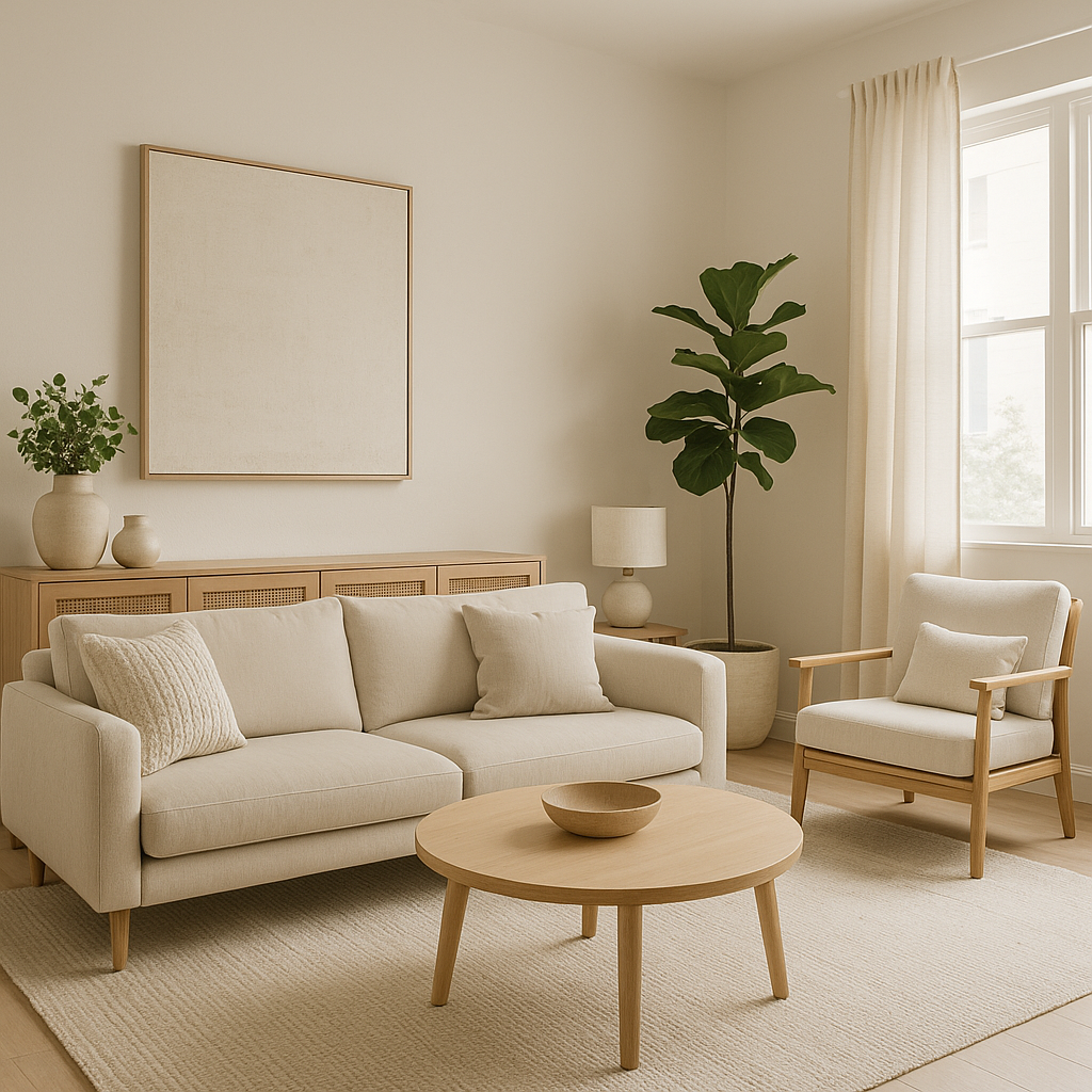
1. Neutral Colors Make Spaces Feel Larger
Small spaces can easily feel cramped or visually busy. One of the main benefits of a neutral palette is its ability to visually expand a room.
Why it works:
- Light colors reflect more light, making the room feel open and airy.
- Uniform tones reduce visual clutter.
- Using similar shades for walls, furniture, and floors creates continuity.
Pro tip:
Use off-white or light taupe on the walls instead of stark white to add softness without sacrificing brightness.
2. They Create a Calm, Relaxing Environment
A neutral color scheme creates a serene foundation that allows your mind to rest—perfect for homes where your bedroom, living room, and office may overlap.
Great for:
- Home offices (boosts focus)
- Bedrooms (encourages rest)
- Studios (balances visual chaos)
If you live in a compact space, your home already works hard. Neutral tones give your eyes and brain a chance to unwind.
3. Neutral Doesn’t Mean Boring
The key to making a neutral space feel dynamic lies in layering and texture.
Add dimension with:
- Linen, cotton, or wool fabrics
- Woven baskets or jute rugs
- Matte ceramics and raw woods
- Subtle pattern mixing (herringbone, stripes, tone-on-tone prints)
You can have a completely beige or white space and still have visual richness—it’s all about material contrast.
4. Flexibility to Change Style Over Time
A neutral base is extremely versatile. It adapts easily to trends or seasonal updates without needing a full redesign.
Easy ways to update:
- Switch pillow covers and throws
- Add new artwork or decorative accents
- Bring in seasonal florals or greenery
- Change lamp shades or small textiles
Neutral backgrounds allow you to experiment with pops of color or shift aesthetics (e.g., from boho to modern) without starting from scratch.
5. Ideal for Small Apartments with Open Layouts
Many modern apartments, especially studios, have little to no physical division between spaces. A neutral palette can help create visual unity and make transitions feel seamless.
For example:
- Use similar beige or greige tones in the kitchen, living area, and sleep nook.
- Choose neutral curtains that blend into the wall color to avoid blocking light.
- Opt for furniture in matching tones to avoid visual “interruptions.”
When your space is limited, harmony is more important than ever.
6. How to Layer a Neutral Palette
The most successful neutral interiors use multiple tones within the same color family. This creates depth and prevents the space from looking flat.
A three-tier layering system:
- Base: Walls, large furniture (sofa, bed), flooring (wood or rugs)
- Mid-tone accents: Throw blankets, dining chairs, cabinetry
- Dark contrast: Framed art, black light fixtures, charcoal pillows
You can also play with warm vs. cool undertones to suit your preference.
7. Add Greenery for a Pop of Life
Plants are a perfect complement to neutral spaces. Their rich green tones contrast beautifully with beige, white, and gray interiors.
Easy houseplants for small spaces:
- Snake plant
- ZZ plant
- Pothos
- Fiddle leaf fig (if you have space and light)
- Herbs in the kitchen for practicality and decor
Use terracotta pots or matte ceramic planters to stay within the neutral aesthetic.
8. Use Neutrals to Highlight Architecture
A simple color scheme draws the eye to natural light, textures, and structural details, instead of overwhelming them.
Examples:
- Exposed beams in whitewashed wood
- Brick walls painted soft gray
- Niche shelving in matching wall tone with spotlighting
- Arched doorways framed in cream or off-white
When you’re not fighting for attention with color, your home’s unique elements can shine.
9. Best Materials for Neutral Interiors
When working with a neutral palette, materials play a big role in adding warmth, variety, and character.
Ideal materials include:
- Natural wood (oak, pine, walnut)
- Linen and cotton fabrics
- Wool or jute rugs
- Brushed brass or matte black hardware
- Concrete or stone accents
These help make the space feel tactile and grounded—not sterile.
10. Don’t Be Afraid of a Statement Piece
Neutral doesn’t mean you can’t have one bold element. In fact, a mostly neutral room is the perfect backdrop for:
- A large piece of artwork
- A sculptural lamp or chair
- A richly textured tapestry
- A dark wood table or headboard
The impact of a single, well-chosen feature is amplified in a minimalist space.
Choosing a neutral color palette is one of the smartest decisions you can make for a small apartment. It brings light, balance, calm, and flexibility—qualities that are especially valuable when you’re working with limited space.
By layering tones, adding texture, and incorporating natural elements, you can build a space that feels open yet cozy, stylish yet timeless. Whether you’re furnishing a tiny studio or redecorating your living room, neutrals provide the foundation for a home that adapts to your needs and grows with your style.